We had to present our two sheets. I was extremely nervous to
the point that I felt my hands shaking slightly. I used PowerPoint to present
my work as I’m still not used to using Adobe Photoshop or Indesign. However,
later on I would have to use those programs since printing my sheets from PowerPoint
my images would be pixelated. I have already done my research at home, and also
taken pictures of my model.
There were a few points raised during my presentation. A
problem with my design was how will the rest area run, and what to do to
prevent homeless people and other things that are not meant to be do in the hub.
Someone suggested that there could be a coin operated turnstiles, like there is
for some public toilets. I thought that it was a good idea to consider bringing
in this system to my design. This was something I need to think about and do
further research on. Also, the images of my design and floor plan are not
really clear. I was told next time to scan the work to the computer, instead of
taking a picture of it.
I thought for this presentation I did slightly better than
the last one, but still needs improvements. I try not to look at the audience,
so it would not increase my nerves. I think I still need to translate my ideas
a bit clearer to the audience, instead of rushing through it. also, I should
speak more louder and clearer.
In the afternoon, we were taught by Sue on using the grids
to draw in perspectives. At first I had a headache from drawing the cubes
because I just did not get it. Afterwards I got a help from my peers and began
to know what to do. Later, we were told to draw anything we like in relations
to what we want to do in the future. I decided to try and draw the interior of
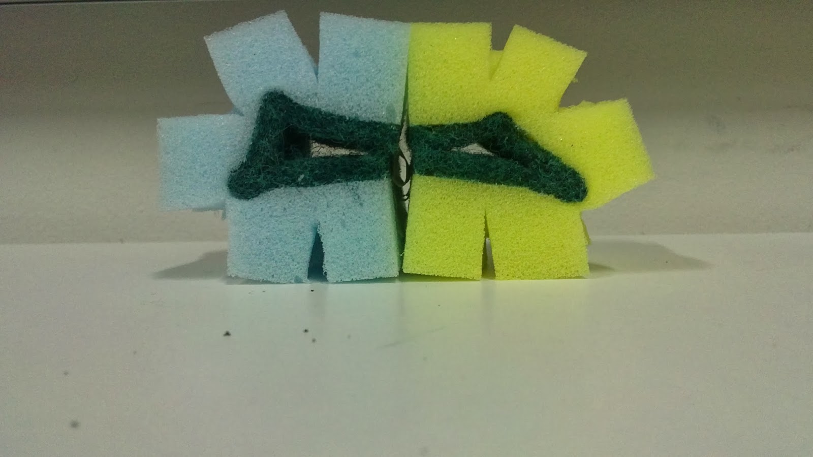
my cubic sponges from this week’s project. I thought my drawing of the cubes in
my sketchbook was really badly drawn, so I attempted to draw those again after
now knowing how to use the grid.


