Friday, October 18, 2013

Graphics - Day 1


We did four experimental portrait drawings. The first exercise involves drawing with our eyes closed. I tried to memorize the person's recognizable features, like her fringe. I realized at first I may be remembering how she looks, but by the end I'm just thinking to myself if I had drawn the main facial features like the nose, eyebrows, ears etc... For this exercise I chose a charcoal stick as my drawing material, because it is very easy to create marks on paper.

The second exercise was to draw using my alternative hand, which is my left hand. I didn’t really like my drawing. I thought I was trying very hard to control my hand and being very careful with how I mark made on the paper. This might explain why the drawing looks so vague, because I was afraid of  putting pressure on my hand. I felt slightly conscious because we were allowed to look at the person, so you should expect the drawing to be good, despite using the alternative hand. 


Next, we weren’t allowed to use our hands, so we had to draw with a pen in my mouth. I used a pink highlighter. I hold the paper in front of me, so it was easier for me to draw. It was really hard and tiring to be constantly moving my head. I realized I started moving the paper instead of my head. Finally, the last task was the same as what we did on the first task but it was a continuous drawing. I used a pen for this task, and I thought the drawing looked very interesting with all the repeated lines. 
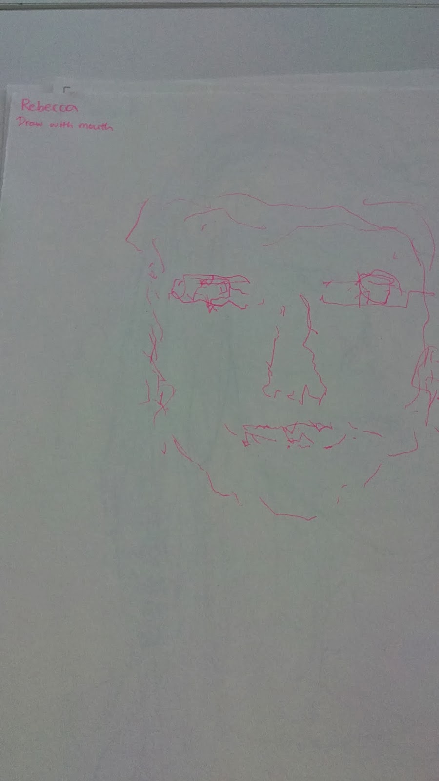

Overall, the exercises were all very fun and relaxing. I don’t feel pressurized for having to draw the exact representation. There is no wrong in these exercises we do, which is what I like about experimental drawings. It was interesting to see everybody’s work altogether, realizing how different every person is and with the way they draw under different circumstances.  


Next task was to draw someone's ear. I never tried drawing just an ear on itself. Whenever I’m drawing ears it is something I find very hard and tend to avoid. This was really the first time I observe closely to someone’s ear to draw. I initially thought it was going to be a difficult for me, as I’m not good at drawing realistically. Also, it made me nervous that I had to draw a enlarge version on an A1 size paper. However, as I started I just got into the drawing. I used charcoal again as I find it is a great tool for large and sweeping strokes. Also, it can be easily smear and good for shading such as hatching. 


We all gather our works together and it shows the diversity in our style of working and also everyone’s ear. I figure through this task that ear itself is unique as everyone’s ear is not the same, and some with earrings make them even more exclusive compare to the others. 


We had to make a collage, creating a new face using our cut outs of celebrity heads. I basically played around with the pictures by constantly ripping them and assembling them together, till I’m happy with it. I thought my collage look slightly realistic like there is such person, as of other collages that I’ve seen where it is obvious the different parts that made up the work.

However, I thought I was being very careful with putting the different parts together, so I think next time I should try being more playful and just have fun with what I’m doing. 


We had to create our own viewfinder, and find in our collage an interesting part that we have to blow up. I decide to blow up between the nose and mouth, because it was the part that I find intriguing. I used a pencil for this task. Next time I should be more prepared with my equipments, so I don’t have to always use the same materials. I find most of my drawings don’t have much colour in them, mainly consists of black and grey.
 

Sunday, October 13, 2013

Review


Review

The Energy and Process exhibition, on level 4 room 3 at the Tate Modern is centred on the radical art movement Arte Povera. It took place in Italy during the 1960s to 1970s. The term was coined by Italian art critic Germano Celant. The exhibition contains sculptures that emphasises on process and explore nature’s energies. Their work rejects the shapes of industrial materials and smooth sleek forms. The sculptors explore simple and raw materials from our everyday life. The exhibition also enables to draw attention to the audience with the gallery space, such as the tremendously high ceiling. The room is curated by Mark Godfey and Helen Sainsbury. 

In Robert Morris’s Untitled, 1967-8 remade 2008, he brought rectangular sheets of industrial felts, which he cuts into straight lines. When the strips are left alone, they would fall from its weight. Morris questioned the Minimalism movement with their fixed geometric forms, so he allowed his work to take control to determine its appearance. In 2008 an interview with Simon Grant, Morris said ‘I wanted to work in a way that would subvert a priori intentions. I wanted to find a way to generate unpredictable, indeterminate consequences.’ This meaning every time he displays this work, the arrangement changes. 

Fig. 1 Robert Morris, Untitled, 1967-8 remade 2008

I was in awe when I first entered the exhibition. There is a diverse range of sculptures and with the way they are displayed in the gallery. There are long wooden planks leaning against the wall to stand; sculptures that reach up to the ceiling and what seems like a melted form displayed in the corner of the room. You have to be very active with the sculptures where you have to look high up or down below on the floor, or even across the room or around the art piece. It does mean that it requires viewers to be opened minded when viewing the works. There are very different sculptures and may be unusual to spectators. 

I see the connection in interests with making things using ordinary materials. Also, the different forms they make are very inspirational. Their sculptures are concerned with exploring changing physical states than representing forms around us. This is something that I would like to challenge in the near future.


Bibliography

Exhibition visit 
Tate Modern  07:10:13


Websites 
Tate. (2013) Art and artists: Artworks. Tate. [online] Available at: http://www.tate.org.uk/art/artworks?rid=5636&ws=date&wv=grid (Accessed 07/10/13)

Tate. (2013) Arte Povera and Anti-Form. Tate. [online] Available at: http://www.tate.org.uk/whats-on/tate-modern/display/arte-povera-and-anti-form (Accessed 07/10/13)  

Grant, Simon and Morris, Robert. (2008) Simon Grant interviews Robert Morris. Tate. [online] Available at: http://www.tate.org.uk/context-comment/articles/simon-grant-interviews-robert-morris (Accessed 12/10/13)


Images
Fig. 1 Robert Morris, Untitled, 1967-8, remade 2008 (Author’s own 07/10/13)


3DD - Day 3


12/09/13

 
Today’s project was to create a structure that can hold up 3 plastic balls. I did a range of designs in my sketchbook, to help build up ideas for when we do create the actual structure. My designs were mostly inspired from Monday’s lesson, where we did different drawing exercises with squiggles, lines and joining random dots together.


We were told that we would be using spaghetti to create our construction. Each person was only allowed 20 strands of spaghetti. My first thought on this task was that it was going to be really difficult, especially already knowing that spaghetti breaks very easily. I tried using blue tacks to stick first before using the glue gun, but the blue tacks won’t stick to the spaghetti. It was extremely frustrating, so I decided to go straight on using the glue gun. Therefore, I gave up on the idea I planned and basically glue the spaghetti randomly together till it was able to hold three balls.
I finished early, so I decided to develop further into the piece.


I extended the piece to see if I can place the balls at different areas in my structure. I think the fact that I didn’t go with my plan and just glue the spaghetti however I wanted, made things quicker for me. I didn’t have to constantly think about the design whether or not it is going to plan.


I find my piece interesting with the way how if you take one of the balls off the piece, it will straightaway fall on its side. This shows that there must be all three balls present at the right place for the work to stay put.


We had to use an A1 size paper to create a protection for our piece, which would be tested by dropping something on top. I folded the piece of paper, thinking it would be stronger with an extra layer. I rolled the paper into a cone, as I thought whatever the object was will be obstructed by the top of the cone. I slightly scrunched the top of the cone, because I thought it will make it stronger, however it just made the paper bend more easily and weaker at blocking things. 


The ball hit very hard onto my work, and did crush parts of my structure. To improve I would have rolled the paper into a cone without folding it together, which means the cone would be much taller. As I think the taller the cone, the longer it will take for the impact to occur. I would also not scrunch the cone, as it just made it bend more easily. I saw someone made a box to cover their work, and it was pretty successful as the ball wasn’t able to break through creating just a dent.